
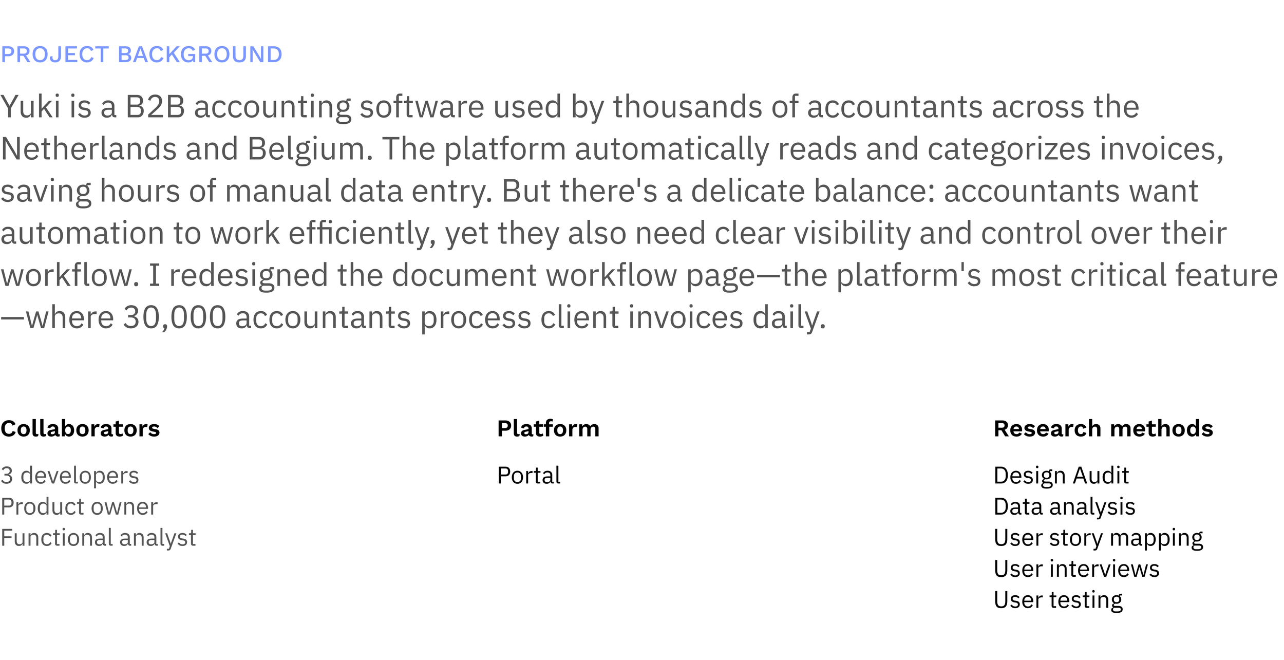
Reimagining invoice workflow for 30,000 users

Challenge
Processing invoices should be straightforward. Accountants are focused, methodical professionals who need to review, book, and process hundreds of documents efficiently. But Yuki's workflow page had become a maze of confusion after years of incremental feature additions.
Users were accidentally interrupting automation by opening documents too early. They couldn't tell which invoices needed their attention versus which ones the system was still processing. 30+ status indicators created cognitive overload without providing clear guidance on what to do next.
This wasn't just frustrating—it was a hidden productivity killer. Accountants were working around the system rather than with it, and every interrupted automation meant tedious manual data entry. My challenge was to transform this cluttered interface into a focused tool that helped accountants work faster while letting automation do its job.
Context & Business Impact
Why This Matters
The document workflow page is the heart of Yuki's platform—the single most-used feature where accountants:
Review incoming invoices from entrepreneur clients
Book documents to appropriate accounts
Ask clarifying questions when needed
Process documents to prevent end-of-quarter backlogs
Understanding the problem


Feature Audit: What are the current features and functions of the feature.
Catalogued every existing feature and function:
30+ document status indicators
Action buttons scattered across the interface
Inconsistent visual hierarchy
Internal research: What have been current problems with the feature, support tickets, existing bugs, issues.
Analysed support tickets and bug reports
Conducted internal interviews
Data analysis : Worked along the team to dive into the usage through Mixpanel and Power BI.
Key findings:
60% of features were used by <5% of users
Many status indicators provided no actionable information
Users frequently opened documents during OCR processing, accidentally stopping automation.
User Story Mapping Workshop: Facilitated sessions with the team to map out the user flows, steps and iterations.
We divided the view into two different flows - to increase automation and have a clear distinction between
View 1: "Let the system work" - Check if automation handled everything
View 2: "I need to intervene" - Fix issues, add missing info, ask questions
User testing : Presented the design to users and asked them to use the prototype and share their feedback.
The semantic differences in color for recognition status was appreciated.
The didn’t need the three different views that we assumed and designed and for the next iteration we reduced it to two views.
Solution
Tried to take the picture apart and relook at how the document gets processed. At what point does the user needs to take action - what kind of action is required. There core things we focused on:
1. Feature Bloat
Unused features cluttered the interface, making core actions harder to find.
2. Status Overload
30+ statuses created cognitive burden without adding value. Users couldn't distinguish between "system processing" vs. "waiting for user action."
3. Automation Interruption
Users unknowingly disrupted automation by opening documents still in OCR processing, resetting the workflow and requiring manual entry.
1. Simplifying features
The Decision Process:
Cross-referenced usage data with user interviews
Identified features used by <5% of users in past 6 months
What We Removed:
40% of action buttons (consolidated or deprecated)
Redundant buttons and views
Status indicators that provided no actionable insight
2. Re-imagining statuses
Users didn't need granular system statuses like "Submitted for processing" vs. "Awaiting recognition"—they needed to know one thing: "Can I act on this, or should I wait?"
We started by mapping the entire document recognition workflow, then audited the codebase to identify unused statuses. We consolidated 30+ statuses into two categories: "Action Required" vs. "System Processing," and added color coding to indicate urgency and next steps.


3.Focusing Attention: Actionable vs. Automated
Users were opening documents to check status while OCR was still running—interrupting automation and forcing manual entry.
Created two distinct views:
View 1: "In Recognition" (System Processing)
Shows documents actively being processed
Read-only preview available
Clear indicator: "Automation in progress—will move to 'To Be Booked' when ready"
Estimated time remaining (when available)
View 2: "To Be Booked" (Action Required)
Only shows documents requiring user input
Opens directly to editable state
Prioritized by urgency/date